


رنگها، قدرتمندترین ابزار در جعبه ابزار یک طراح داخلی هستند. آنها صرفاً یک پوشش برای دیوارها یا کف نیستند؛ رنگها زبان احساسات، شخصیت و انرژی یک فضا هستند. یک انتخاب درست میتواند خانهای معمولی را به پناهگاهی آرامشبخش، فضایی پرانرژی برای کار و خلاقیت، یا یک محیط لوکس و باشکوه تبدیل کند. تسلط بر رنگ در طراحی داخلی، هنری است که با درک چند اصل کلیدی، برای همگان دستیافتنی میشود.
در این راهنمای جامع، ما به اعماق دنیای رنگ سفر میکنیم. از روانشناسی و تأثیر ناخودآگاه رنگها بر ذهن گرفته تا فرمولهای اثباتشده برای ترکیب آنها و نقش کلیدی متریالهای پایه مانند سرامیکهای مدرن در این پالت رنگی. هدف ما این است که به شما، چه یک معمار حرفهای و چه فردی که به دنبال زیباسازی خانه خود است، دیدی شفاف و کاربردی برای استفاده از جادوی رنگ بدهیم. فراموش نکنید که بوم اصلی شما برای این نقاشی، سطوح وسیعی مانند کف و دیوارها هستند؛ جایی که کیفیت و طراحی محصولاتی چون سرامیکهای بادوام PMA و کالکشنهای لوکس IMPERIO میتواند نقطه شروعی بینقص برای داستان رنگی شما باشد.
روانشناسی رنگها؛ فراتر از یک انتخاب ظاهری
قبل از انتخاب هر رنگی، باید بدانیم که آن رنگ با ما و فضای ما چه میکند. هر رنگ، یک فرکانس احساسی خاص دارد و میتواند بر روحیه، انرژی و حتی تصمیمات ما تأثیر بگذارد.
رنگهای گرم : انرژی، صمیمیت و اشتها
رنگ های قرمز، نارنجی و زرد، به عنوان رنگهای گرم شناخته میشوند. آنها یادآور نور خورشید و آتش هستند و حسی از انرژی، هیجان و صمیمیت را القا میکنند.
- قرمز : رنگی پرشور، قدرتمند و پر از انرژی است. استفاده از آن به عنوان یک رنگ اصلی میتواند فضا را کوچک و پرتنش کند، اما به عنوان یک رنگ تأکیدی (Accent Color) در کوسنها، یک اثر هنری یا یک دیوار شاخص، میتواند گرما و زندگی به فضا ببخشد.
- نارنجی : رنگی اجتماعی، دوستانه و شاد است. این رنگ خلاقیت را تحریک کرده و برای فضاهایی مانند آشپزخانه یا اتاق بازی کودکان مناسب است.
- زرد : رنگی سرشار از خوشبینی، شادی و نور. زرد ملایم میتواند فضا را دلباز و روشن کند، در حالی که زرد تند، انرژی زیادی را به محیط تزریق میکند.
رنگ های سرد : آرامش، تمرکز و سکون
رنگ های آبی، سبز و بنفش، رنگهای سرد هستند. آنها طبیعت، آب و آسمان را تداعی کرده و حسی از آرامش، سکون و تمرکز را به ارمغان میآورند.
- آبی : رنگ آرامش، اعتماد و بهرهوری. طیفهای روشن آبی برای اتاق خواب یا حمام، فضایی شبیه به اسپا و آرام ایجاد میکنند، در حالی که آبی تیره (سرمهای) حسی از اقتدار و لوکس بودن را منتقل میکند.
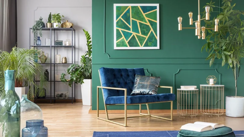
- سبز : رنگ طبیعت، تعادل و هماهنگی. سبز نماد رشد و تازگی است و به دلیل اثر آرامشبخش بر چشم، برای هر فضایی، از اتاق کار گرفته تا نشیمن، مناسب است.
- بنفش : ترکیبی از آرامش آبی و انرژی قرمز. بنفش روشن (یاسی) زنانه و آرام است، در حالی که بنفش تیره، حسی از تجمل، رمز و راز و خلاقیت را به همراه دارد.
رنگ های خنثی : بوم نقاشی شما
سفید، خاکستری، بژ و کرم، ستون فقرات اصول انتخاب رنگ در دکوراسیون داخلی هستند. آنها به خودی خود زیبا و پیچیده هستند، اما مهمترین نقششان، ایجاد یک پسزمینه آرام و متعادل برای درخشش سایر رنگها و عناصر است.
- سفید : نماد پاکیزگی، سادگی و فضا. سفید نور را به بهترین شکل بازتاب میدهد و فضا را بزرگتر و دلبازتر نشان میدهد.
- خاکستری (طوسی) : رنگ تطبیقپذیر، مدرن و متعادل. خاکستری میتواند گرم یا سرد باشد و به عنوان یک پایه خنثی، با هر رنگی به زیبایی ترکیب میشود. این رنگ، پایهای ایدهآل برای خلق دکوراسیونهای شیک و امروزی است.
- بژ و کرم : رنگهایی گرم و دعوتکننده که حسی از راحتی و صمیمیت را به فضا میبخشند.
کالکشنهای سرامیک پرسلان از برندهای PMA و IMPERIO، با ارائه طیف وسیعی از این رنگهای خنثی – از سفید خالص و طوسیهای بتنی گرفته تا کرمهای با رگههای طلایی – به شما این امکان را میدهند که یک پایه ماندگار، زیبا و باکیفیت برای طراحی خود انتخاب کنید.
زبان طراحان؛ درک چرخه رنگ و مفاهیم کلیدی
برای عبور از انتخابهای سلیقهای و رسیدن به نتایج حرفهای، باید با الفبای زبان رنگ آشنا شویم. چرخه رنگ (Color Wheel) نقشه راه ما در این مسیر است.
- فام (Hue) : همان نام خالص رنگ است (قرمز، آبی، زرد).
- ارزش (Value) : به میزان روشنایی یا تاریکی یک رنگ اشاره دارد. (مثلاً آبی آسمانی یک Value روشن از فام آبی است و سرمهای یک Value تیره).
- خلوص یا اشباع (Saturation/Chroma) : به شدت و سرزندگی یک رنگ گفته میشود. (به زبان ساده، یک رنگ چقدر زنده یا در مقابل، چقدر کدر و چرکین به نظر میرسد). یک قرمز آتشین خلوص بالایی دارد، در حالی که یک قرمز آجری خلوص پایینتری دارد.
درک این سه مفهوم به شما اجازه میدهد تا با یک رنگ واحد، پالتهای متنوعی خلق کنید.
هارمونیهای رنگی اثبات شده؛ فرمولهای موفقیت
طراحان برای ایجاد ترکیبات رنگی دلنشین و هماهنگ، از چند فرمول آزمایششده استفاده میکنند :
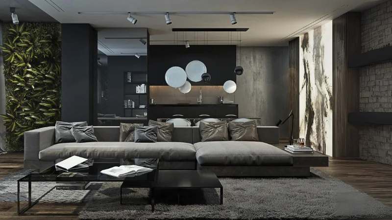
- طرح تک رنگ (Monochromatic) : استفاده از تِن، تُن و سایههای مختلف از یک فام رنگی واحد. (مثلاً استفاده از آبی روشن، آبی متوسط و سرمهای در کنار هم). این روش، فضایی بسیار آرام، شیک و یکپارچه ایجاد میکند.
- طرح رنگهای مشابه (Analogous) : انتخاب رنگهایی که در چرخه رنگ کنار یکدیگر قرار دارند (مثلاً زرد، سبز-زرد و سبز). این طرح، هارمونی دلنشینی دارد و اجرای آن آسان است.
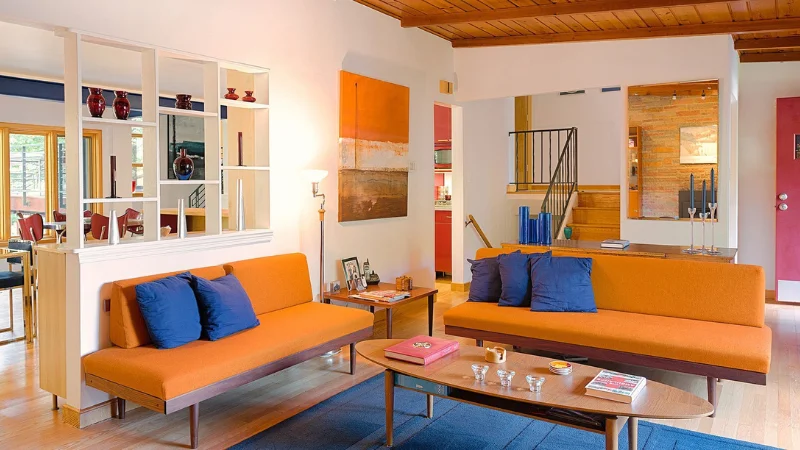
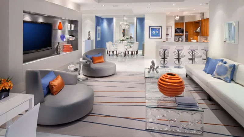
- طرح رنگهای مکمل (Complementary) : انتخاب دو رنگ که دقیقاً روبروی هم در چرخه رنگ قرار دارند (مثلاً آبی و نارنجی یا زرد و بنفش). این ترکیب کنتراست (تضاد) بالایی ایجاد کرده و بسیار پویا و پرانرژی است. برای جلوگیری از تنش بصری، بهتر است یکی از رنگها به عنوان رنگ اصلی و دیگری به عنوان رنگ تأکیدی استفاده شود.
- طرح سه گانه (Triadic) : انتخاب سه رنگ که با فاصله یکسان روی چرخه رنگ قرار گرفتهاند (مانند قرمز، زرد و آبی). این طرح بسیار سرزنده و متعادل است، اما نیازمند دقت بیشتری در اجراست.
قانون طلایی 60-30-10
این یک قانون کاربردی و بسیار محبوب در طراحی داخلی است که به شما در توزیع رنگها کمک میکند :
- %60 رنگ اصلی (Dominant Color) : این رنگ بیشترین سطح را پوشش میدهد؛ مانند رنگ دیوارها یا کفپوش. معمولاً یک رنگ خنثی یا یک رنگ ملایم برای این بخش انتخاب میشود. سطوح وسیع سرامیک پرسلان کف از کالکشن PMA، گزینهای عالی برای این بخش هستند.
- %30 رنگ ثانویه (Secondary Color) : این رنگ برای ایجاد تنوع و عمق به کار میرود و معمولاً در مبلمان، پردهها یا فرش استفاده میشود.
- %10 رنگ تأکیدی (Accent Color) : این رنگ برای ایجاد نقطه کانونی و جذابیت بصری به کار میرود و در وسایل تزئینی کوچک مانند کوسنها، گلدانها و آثار هنری دیده میشود.
کاربرد عملی؛ آوردن تئوری به خانه شما
اکنون که با اصول آشنا شدیم، بیایید آنها را در سناریوهای واقعی به کار بگیریم.
رنگ و ادراک فضا : بزرگنمایی خانههای کوچک
یکی از چالشهای رایج، انتخاب رنگ برای فضاهای محدود است. بهترین ترکیب رنگ برای خانه های کوچک، ترکیبی است که فضا را بزرگتر، دلبازتر و روشنتر نشان دهد.
- به سراغ رنگهای روشن بروید : سفید، کرم، بژ، آبی بسیار روشن و طوسیهای ملایم، نور را بازتاب داده و دیوارها را به لحاظ بصری عقب میبرند.
- از طرحهای تکرنگ (Monochromatic) استفاده کنید : یکپارچگی رنگی، از شلوغی بصری جلوگیری کرده و فضا را بزرگتر جلوه میدهد.
- سطوح براق را فراموش نکنید : استفاده از سطوح صیقلی و براق مانند سرامیک پرسلان پولیش خورده IMPERIO روی کف یا دیوارها، نور را منعکس کرده و به فضا عمق میبخشد.
- سقف را روشن نگه دارید : رنگ کردن سقف به رنگ سفید یا روشنتر از دیوارها، ارتفاع آن را بیشتر نشان میدهد.
قدرت طوسی : یک پایه همهکاره و شیک
رنگ طوسی (خاکستری) از یک رنگ اداری و کسلکننده، به یکی از محبوبترین و شیکترین رنگهای خنثی در دکوراسیون مدرن تبدیل شده است. سوال کلیدی این است که مکمل رنگ طوسی در دکوراسیون چیست؟
- طوسی و زرد/خردلی : ترکیبی مدرن، پرانرژی و بسیار محبوب. گرما و شادابی زرد، سردی و آرامش طوسی را به تعادل میرساند.
- طوسی و آبی (مخصوصاً سرمهای) : ترکیبی بسیار شیک، کلاسیک و مردانه که حسی از اقتدار و آرامش را منتقل میکند.
- طوسی و صورتی مخصوصاً صورتی چرک : ترکیبی لطیف، امروزی و متعادل که فضایی آرام و در عین حال گرم ایجاد میکند.
- طوسی و سبز : ترکیبی الهامگرفته از طبیعت که حسی از تازگی و سکون را به همراه دارد.
یک کفپوش با سرامیک پرسلان طرح بتن از برند PMA یا طرح سنگ با رگههای طوسی از برند IMPERIO، میتواند بوم نقاشی ایدهآلی برای پیادهسازی هر یک از این ترکیبات رنگی باشد.
نقش کف و دیوار : بزرگترین بومهای شما
اغلب، رنگ دیوارها اولین چیزی است که به ذهن میرسد، اما کفپوش و دیوارهای شاخص، نقشی حیاتی در تعیین پالت رنگی فضا دارند.
نقطه شروع طراحی: یک سرامیک پرسلان دیوار با طرح سنگ مرمر از کالکشن IMPERIO را تصور کنید. این سرامیک به خودی خود دارای یک پالت رنگی است (مثلاً سفید، طوسی، رگههای طلایی). شما میتوانید رنگ مبلمان، پرده و اکسسوریها را از دل همین رگهها بیرون بکشید. این رویکرد یکپارچگی و هماهنگی بینظیری را خلق میکند.
ایجاد بافت و عمق: به جای یک دیوار رنگشده ساده، استفاده از سرامیکهای بافتدار یا سهبعدی IMPERIO میتواند به رنگ عمق و شخصیت بدهد. بافت، نحوه تعامل نور با سطح را تغییر داده و جلوهای غنیتر ایجاد میکند.
دوام و زیبایی همزمان: سرامیک پرسلان علاوه بر زیبایی، مزایای فنی بیشماری دارد. این متریال در برابر خراش، لکه و رطوبت کاملاً مقاوم است، به راحتی تمیز میشود و بر خلاف سنگ طبیعی که متخلخل و سنگین است، وزنی سبکتر و نگهداری آسانتری دارد. این ویژگیها آن را به یک سرمایهگذاری هوشمندانه برای سطوح اصلی خانه تبدیل میکند.
تأثیر حیاتی نور و بافت بر رنگ
رنگی که در فروشگاه انتخاب میکنید، ممکن است در خانه شما کاملاً متفاوت به نظر برسد. دو عامل کلیدی در این تغییر نقش دارند: نور و بافت.
- نور طبیعی و مصنوعی : رنگها در زیر نور طبیعی روز، واقعیترین چهره خود را نشان میدهند. نور مصنوعی میتواند رنگ را تغییر دهد. لامپهای رشتهای (آفتابی) تم زرد و گرم به رنگها میدهند، در حالی که لامپهای LED و فلورسنت (مهتابی) میتوانند تم سرد و آبی به آنها ببخشند. همیشه نمونه رنگ را در ساعات مختلف روز و زیر نور مصنوعی فضای خود امتحان کنید.
- بافت سطح (Texture) : بافت، بر “ارزش” (Value) رنگ تأثیر میگذارد.
- سطوح صاف و براق مانند سرامیکهای پولیشخورده : نور را منعکس میکنند، باعث میشوند رنگ زندهتر و روشنتر به نظر برسد و فضا را بزرگتر نشان میدهند.
- سطوح مات و بافت دار مانند سرامیکهای مات : نور را جذب میکنند، باعث میشوند رنگ تیرهتر و ملایمتر به نظر برسد و حسی از گرما و صمیمیت را به فضا اضافه میکنند.
راهنمای رنگ برای فضاهای مختلف خانه
- اتاق نشیمن : به عنوان قلب خانه، باید فضایی دعوتکننده و راحت باشد. رنگهای خنثی و گرم به عنوان پایه، در کنار رنگهای تأکیدی برگرفته از سلیقه شخصی، بهترین گزینه هستند.
- اتاق خواب : پناهگاهی برای آرامش و استراحت. رنگهای سرد و آرامشبخش مانند آبی، سبز و بنفش یا پالتهای تکرنگ و خنثی، انتخابهای هوشمندانهای هستند.
- آشپزخانه : فضایی برای انرژی و فعالیت. رنگهای گرم مانند زرد و نارنجی میتوانند اشتها و خلاقیت را تحریک کنند. استفاده از رنگهای تمیز و روشن مانند سفید نیز بسیار محبوب است. دوام و نظافت آسان سطوح در اینجا حرف اول را میزند، که سرامیکهایPMA | IMPERIO را به گزینهای ایدهآل تبدیل میکند.
- حمام و سرویس بهداشتی : فضایی برای پاکیزگی و آرامش. رنگهای الهامگرفته از آب و طبیعت مانند آبی و سبز، یا ایجاد یک فضای اسپا-مانند با رنگهای خنثی و گرم بسیار رایج است. استفاده از اسلبهای بزرگ سرامیک پرسلان IMPERIO با حذف خطوط بندکشی، فضایی یکپارچه، لوکس و کاملاً بهداشتی خلق میکند.
نتیجه گیری : رنگ، امضای شخصی شماست
اصول انتخاب رنگ در دکوراسیون داخلی یک علم است، اما اجرای آن یک هنر. این راهنما به شما نقشه راه را نشان داد: از درک تأثیر روانی رنگها و یادگیری زبان چرخه رنگ گرفته تا استفاده از فرمولهای هماهنگی و قانون طلایی 60-30-10. ما دیدیم که چگونه نور، بافت و انتخاب متریالهای پایه، همه و همه در نتیجه نهایی تأثیرگذارند.
به یاد داشته باشید که این قوانین برای راهنمایی شما هستند، نه محدود کردنتان. در نهایت، خانه شما بازتابی از شخصیت و داستان شماست. با انتخاب یک پایه محکم، بادوام و زیبا مانند کالکشنهای سرامیک PMA | IMPERIO، شما بهترین بوم را برای نقاشی این داستان فراهم کردهاید. حال، با اطمینان قلم مو را به دست بگیرید و فضایی را خلق کنید که هر روز از زندگی در آن لذت ببرید.