


دنیای طراحی داخلی سرشار از رنگها، الگوها و سبکهای گوناگون است. اما در میان این هیاهوی بصری، یک رویکرد قدرتمند و ماندگار وجود دارد که با تکیه بر سادگی، به اوج زیبایی و شیک بودن میرسد: دکوراسیون مونوکروم. تصور کنید وارد فضایی میشوید که در آن، یک رنگ واحد با تمام سایهها، تُنها و تهرنگهایش، داستانی از آرامش، هماهنگی و عمق را روایت میکند. این، جوهرهی سبک مونوکروماتیک است؛ سبکی که نه تنها یک انتخاب زیباییشناسانه، بلکه یک بیانیهی هنری است.
بسیاری به اشتباه دکوراسیون مونوکروم را معادل استفاده صرف از رنگ سیاه و سفید میدانند. در حالی که این ترکیب کلاسیک یکی از محبوبترین پالتهای مونوکروم است، اما این سبک بسیار فراتر از آن میرود. مونوکروم به معنای «تکرنگ» است و شما میتوانید هر رنگی – از آبی اقیانوسی گرفته تا سبز زمردی یا حتی بژ گرم – را به عنوان پایه انتخاب کرده و با استادی، طیفهای مختلف آن را در کنار هم بچینید.
این مقاله یک راهنمای جامع برای شماست تا با اصول، تکنیکها و رازهای اجرای یک دکوراسیون مونوکروم بینقص آشنا شوید. ما به شما نشان خواهیم داد که چگونه با بازی با بافت، نور و متریالهای هوشمندانه مانند سرامیکهای مدرن، فضایی خلق کنید که نه تنها چشمنواز و آرامشبخش است، بلکه بازتابی از سلیقه و شخصیت شماست. اگر به دنبال یافتن شیک ترین رنگ دکوراسیون منزل هستید، شاید پاسخ در انتخاب یک رنگ و کشف دنیای بیکران آن نهفته باشد.
چرا دکوراسیون مونوکروم هرگز از مد نمیافتد؟
در دنیایی که ترندها با سرعت برق و باد میآیند و میروند، سبک مونوکروم مانند یک لنگرگاه ثابت، جایگاه خود را حفظ کرده است. دلیل این ماندگاری در چندین ویژگی بنیادین نهفته است:
- ظرافت و زیبایی بی زمان : سادگی، کلید اصلی ظرافت است. یک پالت تکرنگ، آشفتگی بصری را از بین میبرد و به فضا اجازه میدهد تا با خطوط معماری، فرم مبلمان و کیفیت متریالهایش سخن بگوید. این سبک به راحتی با گذر زمان کهنه نمیشود و همیشه مدرن و شیک به نظر میرسد.
- ایجاد توهم فضا : استفاده هوشمندانه از طیفهای مختلف یک رنگ میتواند تاثیر شگرفی بر درک ما از فضا داشته باشد. برای مثال، استفاده از سایههای روشنتر در یک اتاق کوچک، آن را بزرگتر و دلبازتر نشان میدهد، در حالی که استفاده از تُنهای تیرهتر میتواند فضایی صمیمی و دنج ایجاد کند.
- برجسته سازی بافت و فرم : وقتی چشم توسط رنگهای متعدد منحرف نمیشود، به طور ناخودآگاه به جزئیات دیگری مانند بافت، شکل و فرم اشیاء توجه میکند. یک کاناپه مخملی، یک دیوار با پوشش سرامیک پرسلان بافتدار یا یک میز چوبی با رگههای طبیعی، همگی در یک پالت مونوکروم جلوهای دوچندان پیدا میکنند. این سبک، بهترین فرصت برای به نمایش گذاشتن زیبایی متریالهاست.
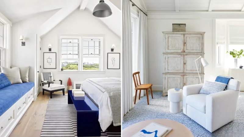
- آرامش و هماهنگی بصری : ذهن انسان در فضایی با پالت رنگی محدود، به آرامش بیشتری میرسد. دکوراسیون مونوکروم با ایجاد یک جریان بصری یکپارچه و هماهنگ، محیطی آرام و به دور از استرس فراهم میکند که برای فضاهایی مانند اتاق خواب یا نشیمن ایدهآل است.
- انعطاف پذیری بالا : برخلاف تصور، سبک مونوکروم محدودکننده نیست. این رویکرد را میتوان در سبکهای مختلفی از مینیمال و مدرن گرفته تا صنعتی و حتی کلاسیک پیادهسازی کرد. کلید موفقیت، انتخاب صحیح رنگ پایه و بازی هوشمندانه با عناصر دیگر است.
اصول کلیدی برای اجرای موفق دکوراسیون مونوکروم
ایجاد یک فضای مونوکروم موفق، فراتر از رنگ کردن تمام دیوارها به یک رنگ است. این یک رقص هنرمندانه بین سایهها و بافتهاست. در ادامه به اصول اساسی آن میپردازیم.
انتخاب رنگ پایه: فراتر از سیاه و سفید
اولین و مهمترین قدم، انتخاب رنگ اصلی شماست. این رنگ، شخصیت و حالوهوای کلی فضا را تعیین میکند.
- خنثی های همیشگی : رنگهایی مانند سفید، کرم، بژ، طوسی و خاکستری، انتخابهایی امن و بسیار محبوب هستند. این رنگها پس زمینه ای عالی برای برجسته کردن مبلمان و اکسسوریها فراهم میکنند و به راحتی با هر سبکی هماهنگ میشوند. یک دکوراسیون طوسی مونوکروم میتواند بسیار شیک و صنعتی باشد، در حالی که پالت بژ، فضایی گرم و دعوتکننده خلق میکند.
- رنگ های جسورانه : اگر به دنبال ایجاد فضایی دراماتیک و منحصربهفرد هستید، از انتخاب رنگهای اشباع شده نترسید. آبی تیره، سبز یشمی یا حتی شرابی میتوانند پالتهای مونوکروم خیرهکنندهای بسازند. نکته کلیدی در اینجا، استفاده از طیف وسیعی از سایههای آن رنگ برای جلوگیری از دلزدگی است.
بازی با سایه ها، تُنها و ته رنگ ها Shades, Tones, and Tints
این سه مفهوم، ابزارهای اصلی شما در جعبهابزار دکوراسیون مونوکروم هستند. بیایید آنها را به زبان ساده تعریف کنیم:
- ته رنگ : هر رنگی که با سفید ترکیب شود. مثال: آبی آسمانی که از ترکیب آبی و سفید به دست میآید.
- سایه : هر رنگی که با سیاه ترکیب شود. مثال: سرمهای که از ترکیب آبی و سیاه حاصل میشود.
- تُن : هر رنگی که با خاکستری ترکیب شود. مثال: آبی دودی که از ترکیب آبی و خاکستری ایجاد میگردد.
برای یک دکوراسیون مونوکروم موفق، باید از ترکیبی از این سه استفاده کنید. برای مثال، در یک اتاق با تم آبی، میتوانید دیوارهای اصلی را به رنگ آبی دودی Tone رنگآمیزی کنید، از مبلمانی با رنگ سرمهای Shade استفاده کرده و کوسنها و پردهها را از رنگ آبی آسمانی Tint انتخاب نمایید. این لایهبندی رنگی، به فضا عمق و جذابیت میبخشد.
اهمیت بافت: قهرمان پنهان فضای تکرنگ
اگر یک راز برای جلوگیری از خستهکننده شدن دکوراسیون مونوکروم وجود داشته باشد، آن «بافت» است. بافت، لایهی لمسی و بصری فضا را غنی میکند. در یک پالت تکرنگ، تضاد بین بافتهای مختلف، جایگزین تضاد رنگها میشود.
- ترکیب بافتهای نرم و سخت : یک کاناپه پارچهای نرم را در کنار یک میز قهوهخوری با سطح صیقلی یک سرامیک اسلب قرار دهید. یا یک فرش پشمی پرزبلند را روی کفپوش سرامیک پرسلان مات پهن کنید.
- استفاده از متریالهای طبیعی : چوب، سنگ، فلز، پنبه، پشم و چرم، همگی بافتهای منحصربهفردی دارند که به فضای مونوکروم شما گرما و شخصیت میبخشند.
- بافت های براق در مقابل مات : یک دیوار با رنگ مات در کنار گلدانهای سرامیکی براق یا آینههایی با قاب فلزی، کنتراست بصری جذابی ایجاد میکند. کالکشنهای سرامیک لوکس مانند IMPERIO با ارائه طیف وسیعی از سرامیکها با سطوح مختلف براق، مات، پولیش خورده و بافتدار به شما این امکان را میدهند که بافت را به عنصری کلیدی در طراحی خود تبدیل کنید.
سرامیک: متریال ایدهآل در پالت تکرنگ شما
وقتی صحبت از انتخاب متریال برای کف، دیوارها یا حتی سطوح کانتر در یک دکوراسیون مونوکروم میشود، سرامیکها به دلیل تنوع، دوام و زیبایی خیرهکننده، یکی از بهترین گزینهها هستند.
سرامیک اسلب بوک مچ: نقطه کانونی خیرهکننده
یکی از هیجانانگیزترین محصولات در دنیای سرامیک مدرن، سرامیک اسلب بوک مچ است. بوک مچ به تکنیکی اطلاق میشود که در آن دو اسلب سرامیکی بزرگ که طرح آنها قرینه یکدیگر است، مانند یک کتاب باز در کنار هم نصب میشوند. نتیجه، یک الگوی متقارن و چشمنواز است که مانند یک اثر هنری بر روی دیوار عمل میکند.
در یک فضای مونوکروم، جایی که از رنگهای زیاد استفاده نمیشود، یک دیوار پوشیده شده با اسلب بوک مچ میتواند به نقطه کانونی اصلی فضا تبدیل شود. رگههای طبیعی سنگ که بر روی این اسلبها شبیهسازی شدهاند، بدون اضافه کردن رنگ جدید، حرکت و پویایی بصری ایجاد میکنند. کالکشن سرامیکهای لوکس IMPERIO، با ارائه طرحهای بوک مچ منحصربهفرد، راهکاری ایدهآل برای خلق یک دیوار شاخص در نشیمن یا حمام مونوکروم شماست.
سرامیک پرسلان: دوام و زیبایی در هم تنیده
سرامیک پرسلان به دلیل مقاومت فوقالعاده بالا در برابر سایش، رطوبت و لکه، یک انتخاب هوشمندانه برای کفپوشها و دیوارهای فضاهای پرتردد مانند آشپزخانه، راهرو و حتی فضاهای صنعتی است.
- مقایسه هوشمندانه : در حالی که متریالهایی مانند سنگ مرمر طبیعی زیبایی چشمگیری دارند، اما به دلیل تخلخل بالا، نیازمند نگهداری مداوم بوده و به راحتی لکه میپذیرند. در مقابل، سرامیکهای پرسلان باکیفیت از کالکشن PMA، همان زیبایی و حس لوکس بودن را با دوام بسیار بالاتر و نگهداری آسانتر ارائه میدهند. این یک سرمایهگذاری بلندمدت برای زیبایی و کارایی فضای شماست.
- یکپارچگی بصری : سرامیکهای پرسلان در ابعاد بزرگ اسلب تولید میشوند که به معنای خطوط بندکشی کمتر و سطحی یکپارچهتر است. این ویژگی در دکوراسیون مونوکروم که به دنبال ایجاد یکپارچگی بصری است، اهمیت ویژهای دارد.
نصب بی نقص: آخرین قطعه پازل
زیبایی سرامیکهای شما تنها زمانی کامل میشود که به صورت حرفهای نصب شوند. برای دستیابی به یک سطح یکپارچه، بهویژه در پالتهای مونوکروم، استفاده از محصولات نصب باکیفیت ضروری است. محصولات شیمیایی PMA، مانند پودر بندکشی همرنگ سرامیک، تضمین میکنند که خطوط بین سرامیکها تقریبا نامرئی شده و زیبایی پالت تکرنگ شما را دوچندان میکنند.
راهنمای عملی: دکوراسیون مونوکروم در فضاهای مختلف خانه
- نشیمن : برای یک نشیمن مونوکروم آرام و شیک، پالت رنگی خاکستری را امتحان کنید. دیوارهایی به رنگ خاکستری روشن، مبلمانی به رنگ زغالی، یک فرش خاکستری متوسط و پردههایی از حریر سفید. برای ایجاد نقطه کانونی، یک دیوار را با اسلب بوک مچ از کالکشن IMPERIO بپوشانید.
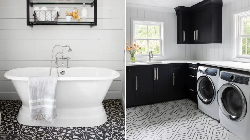
- آشپزخانه : پاکیزگی و کارایی، دو اصل مهم در آشپزخانه هستند. یک دکوراسیون مونوکروم سفید، این دو را به بهترین شکل محقق میکند. کابینتهای سفید مات یا براق، کانترتاپ کوارتز سفید و کفپوش و بینکابینتی از سرامیکهای پرسلان سایز بزرگ و بادوام PMA، فضایی دلباز و همیشه تمیز را برای شما به ارمغان میآورد.
- حمام و سرویس بهداشتی : حمام را با یک پالت مونوکروم بژ یا کرم، به یک اسپای خانگی تبدیل کنید. استفاده از سرامیکهای اسلب با طرح سنگ تراورتن بر روی دیوارها و کف، حس و حالی لوکس و طبیعی ایجاد میکند. خطوط بندکشی کمتر به معنای نظافت آسانتر نیز هست.
- اتاق خواب : برای اتاق خواب که پناهگاه آرامش شماست، از رنگهای آرامشبخش مانند آبی مایل به خاکستری یا سبز سدری استفاده کنید. لایهبندی بافتها در اینجا کلیدی است: روتختی کتان، کوسنهای مخملی و یک فرش نرم، همگی در طیفهای مختلفی از رنگ پایه شما.
اشتباهات رایج و نحوه اجتناب از آنها
فضای بی روح و تخت : رایجترین اشتباه، نادیده گرفتن بافت است. همیشه ترکیبی غنی از بافتهای مختلف را در فضا به کار ببرید.
محیط سرد و استریل : اگر پالت رنگی شما به سمت رنگهای سرد متمایل است مانند سفید خالص یا خاکستری سرد، با اضافه کردن عناصر چوبی، نورپردازی گرم آفتابی و گیاهان سبز، به فضا گرما و زندگی ببخشید.
ترس از کنتراست : مونوکروم به معنای استفاده از یک درجه رنگی ثابت نیست. جسور باشید و از تیرهترین سایه تا روشنترین تهرنگ در پالت خود استفاده کنید تا عمق و جذابیت بصری ایجاد نمایید.
سخن پایانی
دکوراسیون مونوکروم، بیش از یک سبک، یک فلسفه در طراحی است؛ فلسفهای که بر قدرت سادگی، هماهنگی و تمرکز بر کیفیت تاکید دارد. این رویکرد به شما اجازه میدهد تا با حذف موارد اضافی، به اصل زیبایی برسید. با انتخاب هوشمندانه رنگ پایه، بازی استادانه با سایهها و بافتها، و استفاده از متریالهای بادوام و زیبایی مانند سرامیکهای PMA و IMPERIO، میتوانید فضایی خلق کنید که نه تنها امروز، بلکه برای سالهای آینده، شیک، آرامشبخش و الهامبخش باقی بماند. به دنیای تکرنگها قدم بگذارید و زیبایی بیپایان آن را کشف کنید.